How do you create tabs in Adalo?
Choose between Adalo screen navigation and state-like tab content, then keep active styling, focus, context, and responsive behavior clear to users.
We checked current official documentation, captured the relevant screens, and compared the workflow with dated Adalo forum reports. Source links and limitations are below so you can judge the evidence directly.
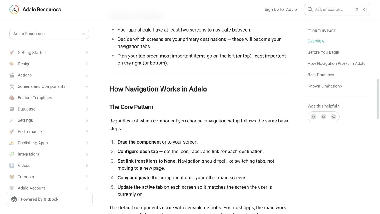
Use linked screens for primary navigation and conditional content states for tabs that belong to one record. Keep the active tab visible and preserve context across changes.
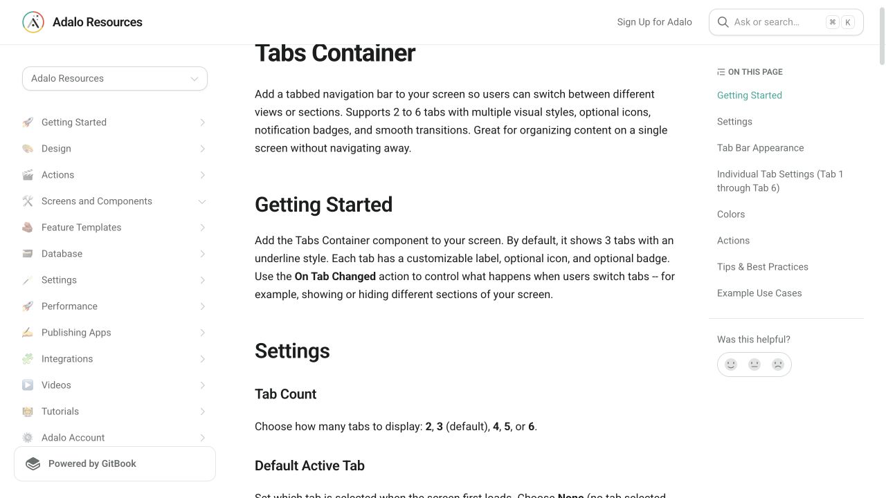
Use separate screens for primary destinations and the current Tabs Container when panels belong to the same screen context. Derive the active style and visible content from one source of truth, then test back behavior, reload behavior, and responsive layout. The current component is publicly documented, but this article does not claim a hands-on reproduction.
The intended outcome
Clear tab navigation whose active state matches the visible content.
Requirements
- Two or more related content views
- A stable navigation model
Step by step
- 01
Choose navigation or state
Use screens for major destinations and in-screen states for tightly related content.
- 02
Create the tab row
Label tabs with short nouns that match their content.
- 03
Make active state unmistakable
Use color, weight, and an indicator rather than color alone.
- 04
Test back behavior
Confirm browser, device, and in-app navigation stay understandable.
The underlying logic
Tabs are a spatial promise: selecting a label changes the associated panel without surprising context loss.
Data model
| Collection | Important properties | Relationships |
|---|---|---|
| Optional UI state record | Active Tab | Belongs to a session or user only when persistence is necessary |
What changed?
- The refreshed answer separates primary navigation from record-specific content switching.
Common failure modes
Active styling and content disagree
Derive both from the same saved state or screen destination.
Testing checklist
0 of 6 checked on this device
Current limitations
- Marketplace components can change independently, and the forum history includes responsive and icon-only issues that were later reported fixed.
Screenshot evidence
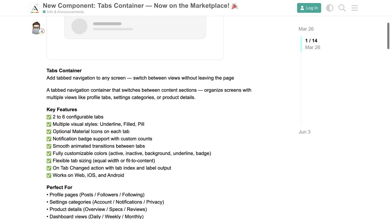
These captures document what Adalo currently publishes and what builders are reporting. They support the written guidance, but they are not a substitute for an end-to-end test in your own app.
What the Adalo community is reporting
These are concise editorial summaries of public forum posts—not endorsements or independently reproduced results.
New Component: Tabs Container
The announcement documents two to six tabs, visual styles, badges, transitions, and an On Tab Changed output; later replies confirm fixes were shipped.
Boundary: The thread also records responsive scaling and icon-only issues before subsequent fixes, so every target layout still needs preview testing.
AKyle and follow-up replies · March–June 2026Sources and status
This page was last reviewed on Aug 12, 2026. Its current status is Verified from current public evidence.
Verification owner: Adalocado editorial. Next review: Sep 12, 2026.
Changelog
Added current Tabs Container documentation and its 2026 announcement and fix history.
Did this solve your problem?
Never deal with an Adalo problem again.
Rehost becomes the monthly team behind your app. Fixes, releases, integrations, and ongoing changes have an owner.
See monthly managementBring us the messy version.
Describe what you expected, what happened instead, and what you already tried.
Ask Adalocado 💬